No Fill Marks? … New video intro to previous post about my French press.

In a previous post, I talked about my French press coffee maker which has no fill level marks to help me add water to the same place every time. This short video introduces that post, and shows you my current French press. It is for people who own French press coffee makers AS WELL AS designers and anyone interested in innovation and creativity. It also shows the mind map you can explore while learning some proximity thinking at the same time!

Hacking IKEA — Repurposing an IKEA Ice Tray

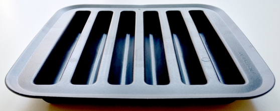
IKEA has ice trays for making ice in unusual shapes. The photos below show one of the ice trays that makes long thin ice cubes. But in this case, they should be called not “cubes” but ice sticks I guess. Anyway, when I saw them, I thought they were cool objects, and since I wasn’t sure what they were at first, I started wondering what they might be. This is one side, which you would fill with water to make ice sticks.

IKEA Ice Tray (side A) for Proximity Thinking Example

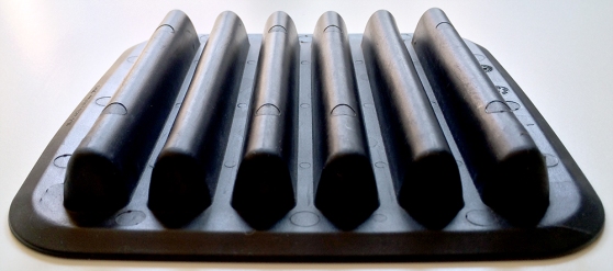
This is the other side. It’s the bottom in relation to the water-filling side, but in some of the ways I’ve used these objects, I’ve come to think of the side shown below as the top! I may add more photos/video later to show some of the ways I’ve repurposed these ice trays, but I describe them in the mind map farther down this page.

IKEA Ice Tray (side B) for Proximity Thinking Example

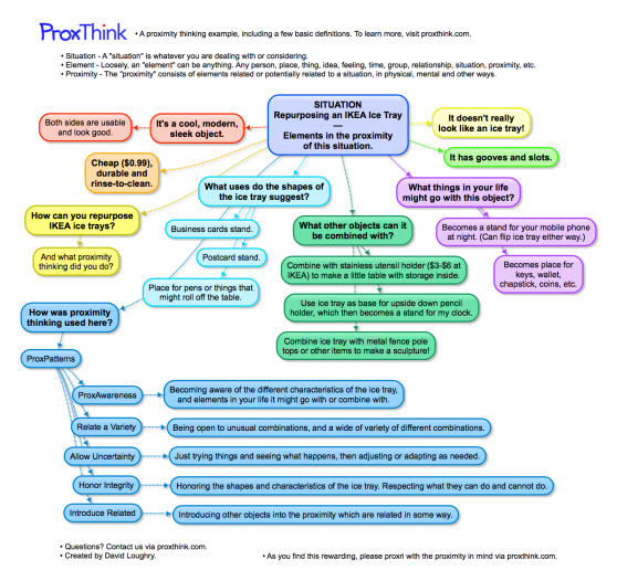
The mind map below explores this situation. It describes some ways to repurpose these ice trays, and shows how some proximity thinking was used. Click the image below to open it full-size. Once open, you can zoom it even larger.

Repurposing an IKEA Ice TrayNOTE — THE REST OF THIS PAGE IS BASICALLY JUST FOR SEARCH ENGINES.
Since search engines can’t index the text in an image, I’m including the text from the graphic below. However, I’d recommend only looking at the graphic, as it will make a lot more sense. Also, WordPress is adding some blank lines in the outline below, and I can’t fix it. So please imagine there are no blank lines!

• A proximity thinking example, including a few basic definitions. To learn more, visit proxthink.com.
• Situation – A “situation” is whatever you are dealing with or considering.
• Element – Loosely, an “element” can be anything. Any person, place, thing, idea, feeling, time, group, relationship, situation, proximity, etc.
• Proximity – The “proximity” consists of elements related or potentially related to a situation, in physical, mental and other ways.

  • SITUATION
    Repurposing an IKEA Ice Tray

    Elements in the proximity
    of this situation.

    • It’s a cool, modern,
      sleek object.

      • Both sides are usable
        and look good.
    • Cheap ($0.99),
      durable and
      rinse-to-clean.
    • It doesn’t really
      look like an ice tray!
    • It has gooves and slots.
    • What uses do the shapes of
      the ice tray suggest?

      • Business cards stand.
      • Postcard stand.
      • Place for pens or things that
        might roll off the table.
    • What things in your life
      might go with this object?

      • Becomes place for
        keys, wallet,
        chapstick, coins, etc.
      • Becomes a stand for your mobile phone
        at night. (Can flip ice tray either way.)
    • What other objects can it
      be combined with?

      • Combine with stainless utensil holder ($3-$6 at
        IKEA) to make a little table with storage inside.
      • Combine ice tray with metal fence pole
        tops or other items to make a sculpture!
      • Use ice tray as base for upside down pencil
        holder, which then becomes a stand for my clock.
    • How can you repurpose
      IKEA ice trays?

      • And what proximity
        thinking did you do?
    • How was proximity
      thinking used here?

      • ProxPatterns
        • ProxAwareness
          • Becoming aware of the different characteristics of the ice tray,
            and elements in your life it might go with or combine with.
        • Relate a Variety
          • Being open to unusual combinations, and a wide of variety of different combinations.
        • Allow Uncertainty
          • Just trying things and seeing what happens, then adjusting or adapting as needed.
        • Honor Integrity
          • Honoring the shapes and characteristics of the ice tray. Respecting what they can do and cannot do.
        • Introduce Related
          • Introducing other objects into the proximity which are related in some way.

• Questions? Contact us via proxthink.com.
• Created by David Loughry.
• As you find this rewarding, please proxri with the proximity in mind via proxthink.com.

Some belts always fit just right. Let’s ProxThink about that.

Some belts, like the web belt below which allows the buckle to push through anywhere, always fit just right. Let’s use proximity thinking to consider this situation.

Continuously Adjustable Belt for Proximity Thinking Example

The mind map below explores this situation. Click the image below to open it full-size. Once open, you can zoom it even larger.

Belts that Fit Just RightNOTE — THE REST OF THIS PAGE IS BASICALLY JUST FOR SEARCH ENGINES.
Since search engines can’t index the text in an image, I’m including the text from the graphic below. However, I’d recommend only looking at the graphic, as it will make a lot more sense. Also, WordPress is adding some blank lines in the outline below, and I can’t fix it. So please imagine there are no blank lines!

• A proximity thinking example, including a few basic definitions. To learn more, visit proxthink.com.
• Situation – A “situation” is whatever you are dealing with or considering.
• Element – Loosely, an “element” can be anything. Any person, place, thing, idea, feeling, time, group, relationship, situation, proximity, etc.
• Proximity – The “proximity” consists of elements related or potentially related to a situation, in physical, mental and other ways.

  • SITUATION
    Belts that fit just right.

    Elements in the proximity of
    this situation.

    • Everyone has a
      different size waist.
    • Most belts have a few
      holes rather than being
      continuously adjustable.

      • So belts only fit well if your waist
        matches one of the holes on the belt.
    • Fashion and trends
      considerations.
    • Design and manufacturing
      considerations.
    • Belt materials and
      technology.
    • Poor-fitting belts may have
      physical and psychological
      effects on the wearers.
    • Continuously adjustable
      belts fit the best.

      • Such as web belts that allow the buckle to
        push through anywhere. Or, belts with buckles
        that can grasp the belt at any point.
      • Let’s think about this from a
        proximity thinking point of view.

        • ProxPatterns
          • Transition Smoothly
            • Continuously adjustable belts transition smoothly between any size waist. They
              adjust if you want them a bit looser after a meal, or a bit tighter if you’re slimmer.
          • Honor Integrity
            • Continuously adjustable belts honor the characteristics of your exact waist size.
          • Avoid Forcing
            • Continuously adjustable belts avoid forcing you to live
              with a belt that is a little too snug or a little too loose.
    • Some people may be willing to
      put up with a less-than-perfect fit
      to get other benefits.

      • Let’s think about this from a
        proximity thinking point of view.

        • ProxPatterns
          • Honor Integrity
            • For some people, fashion may outweigh comfort considerations.
              They have a higher regard for fashion than for comfort, and in
              doing so they honor the integrity of fashion in their life.
          • ProxAwareness
            • Belts with holes are more widely sold than continuously adjustable
              belts. So consumers, retailers, designers and manufacturers may
              be less aware of the benefits of a belt with perfect fit.
          • Limits of One
            • There are limits of any one technology or style to be accepted
              or used. So there may be limits to the widespread adoption of
              continuously adjustable belts.

• Questions? Contact us via proxthink.com.
• Created by David Loughry.
• As you find this rewarding, please proxri with the proximity in mind via proxthink.com.

My Bodum French Press Could Use Some Proximity Thinking

My French press coffee maker, by Bodum, could use some proximity thinking. More specifically, it has no fill level marks to help me add water to the same place every time, as you can see from the picture.

UPDATE: I made a short video intro to this post! You can watch it here.

Bodum French Press for Proximity Thinking Example

The mind map below should be pretty self-explanatory. Click the image below to open it full-size. Once open, you can zoom it even larger.

NOTE — THE REST OF THIS PAGE IS BASICALLY JUST FOR SEARCH ENGINES.
Since search engines can’t index the text in an image, I’m including the text from the graphic below. However, I’d recommend only looking at the graphic, as it will make a lot more sense. Also, WordPress is adding some blank lines in the outline below, and I can’t fix it. So please imagine there are no blank lines!

• A proximity thinking example, including a few basic definitions. To learn more, visit proxthink.com.
• Situation – A “situation” is whatever you are dealing with or considering.
• Element – Loosely, an “element” can be anything. Any person, place, thing, idea, feeling, time, group, relationship, situation, proximity, etc.
• Proximity – The “proximity” consists of elements related or potentially related to a situation, in physical, mental and other ways.

  • SITUATION
    No fill level marks on my
    French press coffee maker.

    Elements in the proximity of
    this situation.

    • Different people have different
      preferences for how much coffee to
      make. And different size cups too.
    • Glass pot with instructions on
      side, but no fill level marks.

      • So we know they can
        paint on glass!
    • The need to consistently make a good
      cup of coffee just the way you like it.

      • Once you figure out how much water and
        how many ground coffee scoops you
        like, it should be easy to repeat that.
    • With French presses, the coffee
      grounds stay in the pot and absorb
      some water, so it affects fill levels.

      • So a strong cup with more coffee
        grounds might take more water.
    • International sales
      means it’s better to avoid
      choosing ounces or liters.

      • Yet fill lines need some unique
        marks to tell them apart.

        • However numbers might be a poor
          choice since people might think they
          relate to liters or ounces.
    • Possible solution that relates to
      the elements in this proximity.

      • Many fill lines painted up the side,
        every quarter inch (6 mm) or so.

        • Mark each line with letters
          and/or a symbol or shape.

          • Suggest that the first time you make coffee, get a rough idea of the best fill line as
            follows: Fill your cup(s) with cold water and pour into the French press, so you can
            note which fill line is closest. Then add a couple lines for the coffee grounds.

            • After you make a few pots of coffee and make minor adjustments,
              you’ll know how many ground coffee scoops you like, and which
              fill line works best. Then you can do it the same every time.
    • How was proximity
      thinking used here?

      • The Core Idea
        • The ProxThink Core Idea is: “In a situation, change elements, relationships
          and the proximity to better relate to each other.” The blue crosslink lines
          above show some of the elements these solutions relate to better.
      • ProxPatterns
        • Relate a Variety
          • Many closely-spaced fill lines up the side relates to a
            wider variety of people, preferences and cup sizes.
        • Honor Integrity
          • Avoiding markings related to ounces, liters or numbers honors the
            need for international sales and the need to avoid confusion.
        • Create Links
          • Many closely-spaced fill lines marked with letters and/or symbols and shapes creates
            a link between the fill line that works best for you and the next time you make coffee.
        • Avoid Forcing
          • We avoided forcing people to use ounces, if they’re used to liters, and vice versa. And
            by using many fill lines, we avoided forcing the lines to relate to fixed cup sizes.
        • ProxAwareness
          • To become more aware of elements in the proximity of this situation.

• Questions? Contact us via proxthink.com.
• Created by David Loughry.
• As you find this rewarding, please proxri with the proximity in mind via proxthink.com.

Suggestions for iPhone folder icons

About the user interface for iPhone folder icons …

With app icons on the iPhone, we have nice big visual cues. With folder icons, they all look the same, and they have one line of very small text at the bottom as the main thing that differentiates them.

Suggestions: It would be great if the text you chose for the folder filled the icon itself. Maybe we could even scale and crop the text, like we scale and crop a wallpaper image, so that just the letters we want fill the icon. And what if we could also choose a color for the icon, or even choose a photo or some clip art for the icon? The iPhone suggests categories when you make a folder, so maybe it could also suggest an image for the icon. Maybe the icon also gets bigger, so a folder icon takes the space of two or four app icons.

How would I describe these suggestions in some proximity thinking terms?

  1. These changes would honor the integrity of how our eyes work. That’s the whole point of icons in the first place. You can distinguish something at a glance when it’s a good icon.
  2. These suggested changes are an example of the ProxThink Core Idea, which is: In a situation, change elementsrelationships and the proximity to better relate to each other. The situation is the challenge of telling the folder icons apart. Our eyes, our vision, the iPhone screen, technology and readability-at-a-glance are elements and relationships, among others of course, in the proximity of this situation. The suggestions above change elements and relationships (text in icon, scaling, cropping, color, photos, clip art, icon size) for the icons. These change our user relationships to the icons, and in the process also change the proximity of this situation to the extent that perhaps it’s no longer a situation!

Cool but lame sink?

Cool but lame sink? image 1 proxthinkriver.com. IMG_0615 1100pxmax

Cool but lame sink? image 2 proxthinkriver.com. IMG_0614 1100pxmax

This hip sink is sort of like fashionable shoes that hurt.

I like being hip and cool as much as the next guy, but not so much in the bathroom.

I stayed at an Aloft Hotel in Dallas recently, and there it was, an uber-cool sink.

Cool, that is, until you try leaning on it when you’re shaving or brushing your teeth or rinsing your mouth.

That’s when the sink cuts into your hand or your arm.

That’s when you know the price of being cool.

I’d like designers to relate to a wider variety of constraints. Why can’t a sink have a cool shape AND be ergonomic? This sink is like a monoculture, being mainly a geometric design, but monocultures are not very sustainable.

Where’s the ProxAwareness? Did they test this on androids or people? Did they try it themselves? They needed to honor the integrity of the hands and arms that will interface with this sink.

They needed to use the Core Idea of proximity thinking: In a situation, change elementsrelationships and the proximity to better relate to each other.

Next time, they might want to ProxThink that.